Graph Drawing
[A pdf version of this section can be downloaded]
Graph drawing has problems with scalability when the number of nodes
and connections grow. As a result the performance is compromised and
the edge representation becomes too cluttered. Filtering data is
generally used to decrease graph complexity: previous filtering
through external tools, neighbor criteria and focus+context
techniques are some examples of filtering.
In order to reduce edge cluttering, different edge drawings
(splines, transparency, hiding) have been developed with different
degrees of success. Social networks can usually be separated in
groups, such as close friends, people involved in the same project
or families. Using this grouping, zone graphs have been developed,
wrapping separate groups of nodes by areas.
We have developed a zone graph directed by forces regarding
relationships in Hollywood movies. The use of zones avoids
edge cluttering, while the use of filters (by means of
ancillary linked views, such as parallel coordinates or scatter
plots) used previously to graph drawing reduces graph
complexity. Overlapping zones and representation of nodes help in
finding interesting relationships within the graph, such as people
working together in different movies, hub nodes or paths between
nodes.
Group Definition
We consider a 'group' the whole cast for each movie. This concept
can be directly transferred to other social networks as it is the
case of authors of an article or workers involved in a project. In
the case of movies, group's sizes range from 2 to more than 200
people. Data have been obtained from US movies made after 2000,
collecting the corresponding information from www.imdb.com.
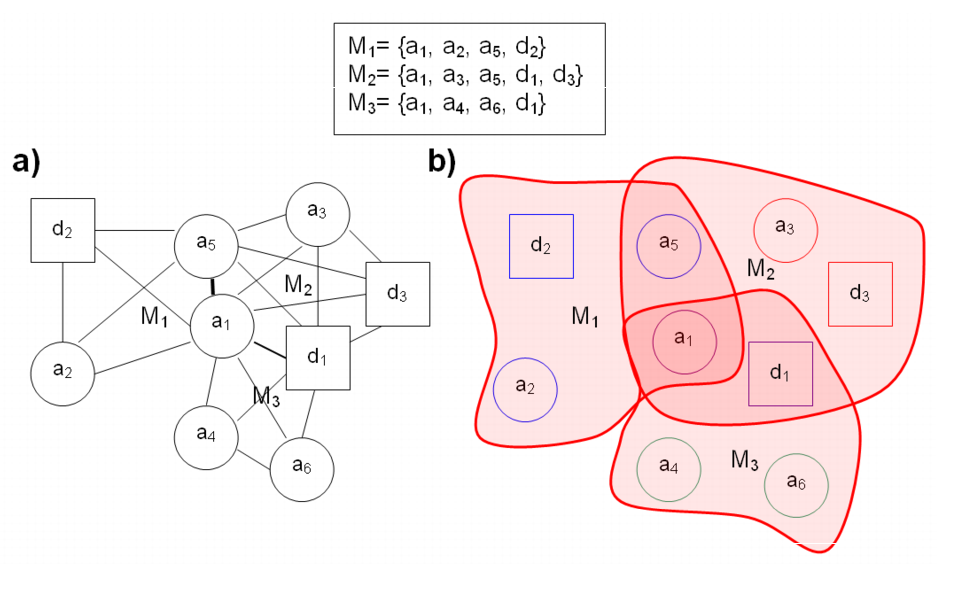
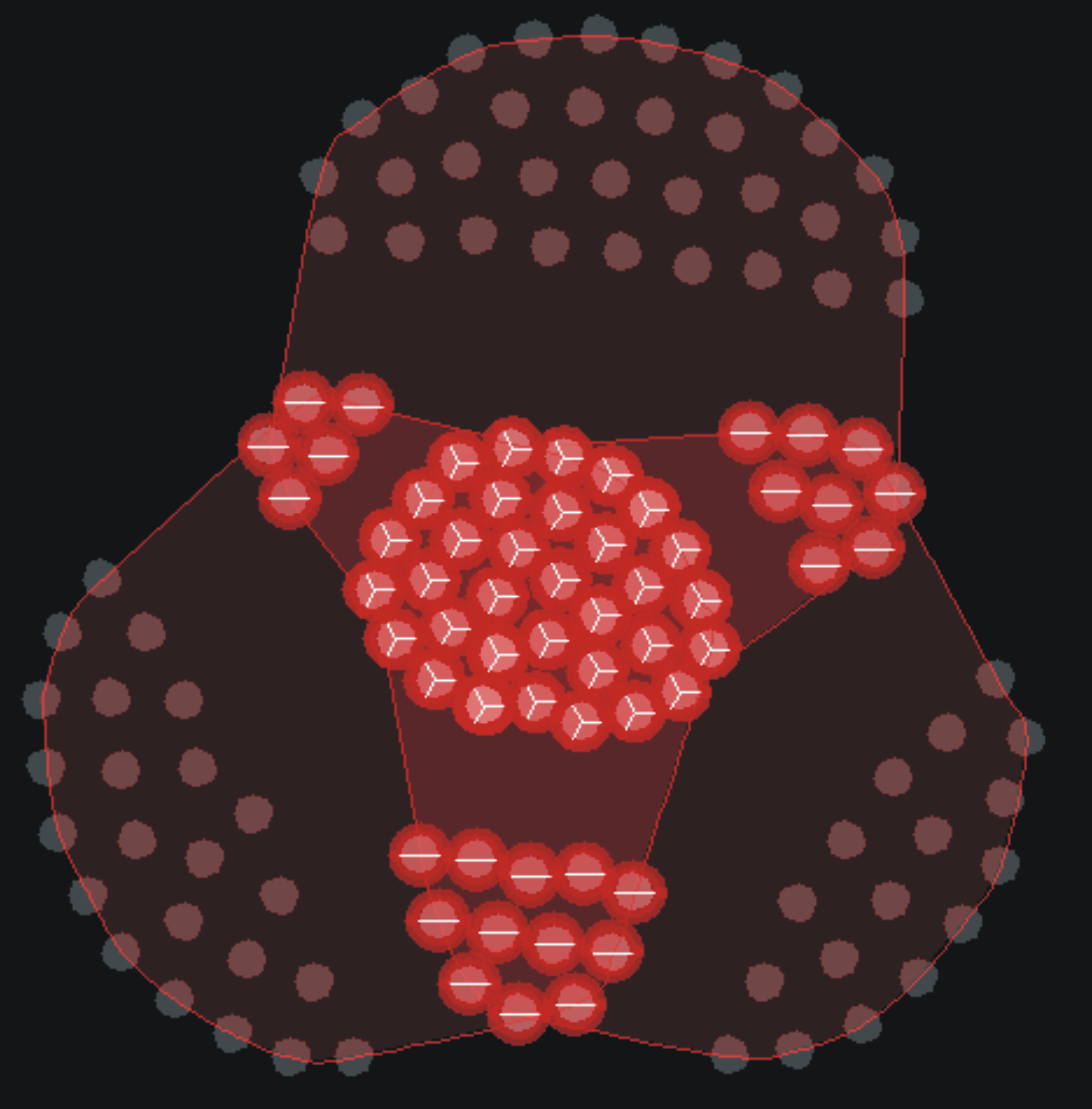
Figure 1. Three movies and their representation. Different roles in
the movie are represented by different shapes (here, for example,
directors are squares and actors are circles).
Each movie is displayed using an undirected complete graph where nodes are
the set of people involved in the movie. Edges
connect nodes that appear in the same group but, to avoid edge
cluttering, edges are not drawn and instead transparent hulls wrap
each group (see fig. 1 above). The overlapping
of hulls makes intersection regions more opaque, helping in
identifying highly connected groups without recurring to edges or
even nodes in an overview.
Graph Layout
The nodes are displayed following a force-directed
layout. In our model, each pair of nodes can be
affected by up to two forces. If the nodes are connected, a spring
force acts to keep them at an optimal distance, with a determinate
stiffness. Between every pair of nodes, connected or not, an
expansion force makes them to repel each other. The string force
keeps nodes in the same movie close, while the expansion force
separates nodes in different movies. Fig. 2
illustrates the entire process of graph building and layout.
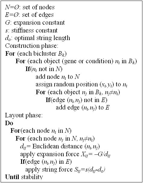
Figure 2. Graph drawing algorithm
Node Representation
Node positions are defined by the graph layout, but additional
information is present at the level of node representation, by the
means of glyphs, at user's demand. A glyph is a graphical object
designed to convey multiple data values. The
size, color and shape of the glyph represent different dimensions.
In our case:
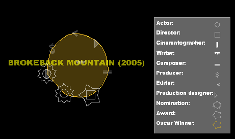
Figure 3. Roles legend and it's application in a movie. We can easily determine that the cinematographer of 'The Passion of the Christ' have been nominated, there are two writers, one of them being the director and co-producer of the movie.
- Graph Interaction
In order to foster knowledge discovery, the visualisation is not an
static image, but a user driven representation that can be
manipulated in a number of ways. Besides controlling node drawing
explained above, user can:
- Change force parameters for string and expansive forces.
- Modify the representation by dragging nodes and by fixing node
positions.
- Search for person names or film titles.
- Visualise or hide edges and hulls.
- Highlight the nodes connected to a particular node.
- Overview and detail of the represented graphs.
The final result of the graph display is a set of flexible
overlapped, colored areas representing movies, with glyph nodes
inside representing persons and their different roles. Drawing these
areas instead of drawing edges, along with its flexibility, allows a
large number of films to be represented without excessive cluttering
on the display. Fig. 4 shows how the layout works with a
simple case, giving insight of how three movies relate with just a
glance.
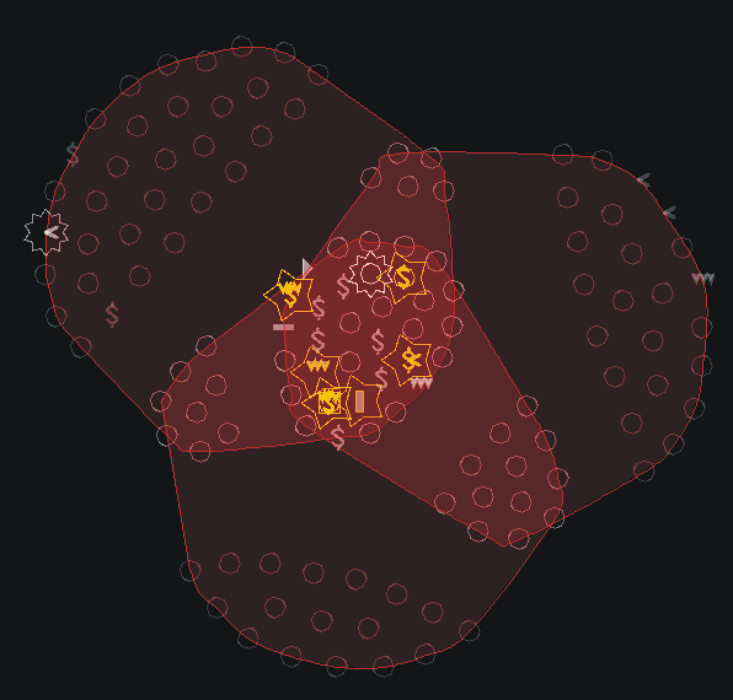
Figure 4a. Visualization of the trilogy of 'The Lord of the
Rings'. Zones for people involved in one, two or the whole trilogy
are easily distinguishable. Deep insight is achieved with just a
glance. For example, occasional involvements are usually actors
and the persons that won awards because of the trilogy were present
in the all its films.
Figrue 4b. Same films, but now node roles are hidden and instead pie charts representing the number of films involved are drawn, making intersecting areas even clearer
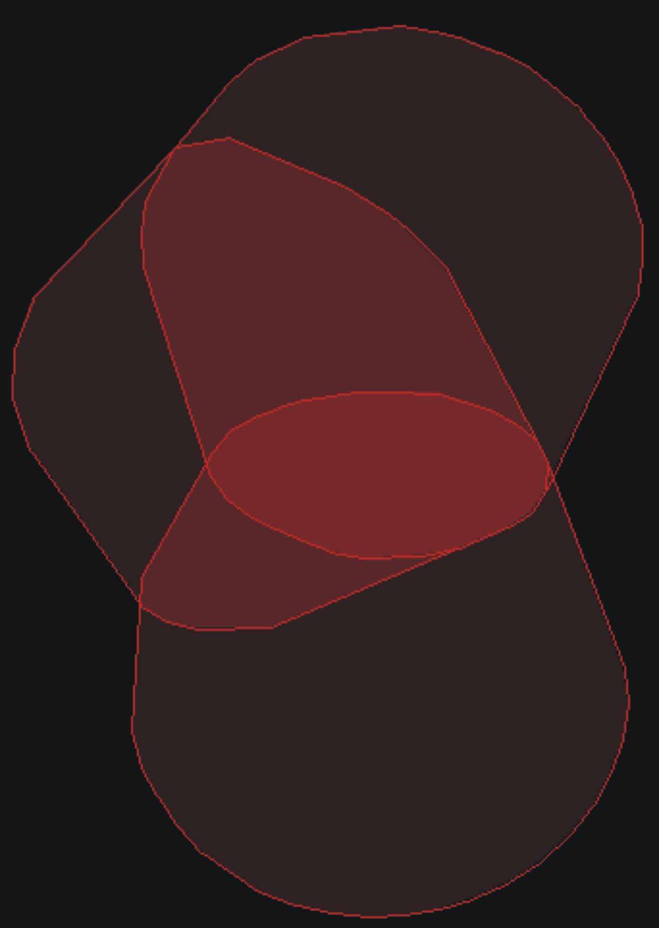
Figure 4c. Visualization of zones alone, hidding nodes along with edges.
Graph Complexity
The most important drawback of force-directed layouts is
complexity. An optimal implementation has a complexity of order
O(n3) itealp{Herman2000}), being n the number of nodes. The
drawing of the whole set of movies (more than 20.000, with around
300.000 persons involved) is obviously impossible and not very
useful anyway.
To reduce this dimensionality, filters have been implemented. First,
a movie filter through different simple visualizations (scatterplots
and parallel coordinates) allow to select films under numerical
criteria (box office earnings, number of awards, year, imdb ratings,
etc.) Second, a text filter allow to select only movies with a
determinate title, genre or person involved. Finally, the cast of
each movie can also be filtered by any threshold to only visualize
the most relevant people involved.
Playing with filters, our tool can deal without relevant loss of
interactivity with up to 500 nodes, on an Intel Pentium D 2.8 GHz
processor. This allows analysis of the 50 most profitable movies,
comparisons between the top-ten movies by budget and the oscarized
movies or the inspection of an actor's filmography, for example.
Graph Overlapping
Overlapping is usually seen as a problem in zone graph drawing
because overlapped zones hide information of objects under it, it is
difficult to identify the group to which a node pertains if it is in
an overlapped area and eventually zone cluttering could appear as
happens with edge cluttering.
We have tried to make overlapping a part of the solution instead of
part of the problem by the use of different techniques. In first
place, the use of transparency to fill zones (keeping an opaque
border to identify limits) makes easy to identify overlapping areas,
avoiding to hide nodes or areas under it. Fig.\ref{lotr} shows how
areas with one, two or three overlapping zones are easily
identifiable thanks to transparency degrees, without losing the
identity of each movie.
On the other hand, when a node is in a area corresponding to two
overlapping zones, pie chart representation of nodes helps to
discern if the node is in both areas (two sectors) or only one (no
pie chart). Due to force directed layout, most of the nodes will
appear well positioned when stability is reached, but until then, or
in the case of very connected graphs, pie charts can be very
helpful.
Finally, apart from the overlapping of zones of different movies
because of intersecting persons, our implementation allows the use
of color to identify movies under different numerical or textual
criteria, with the use of filters. This way we can, for example,
visualize Steven Spielberg's movies and awarded movies with
different colors (for example, yellow and cyan) and see how these
sets of movies interact (awarded movies of Steven Spielberg will
appear as green zones, with blue/yellow piecharts for all the people
involved) Fig.5 shows the overlapping issue in detail.
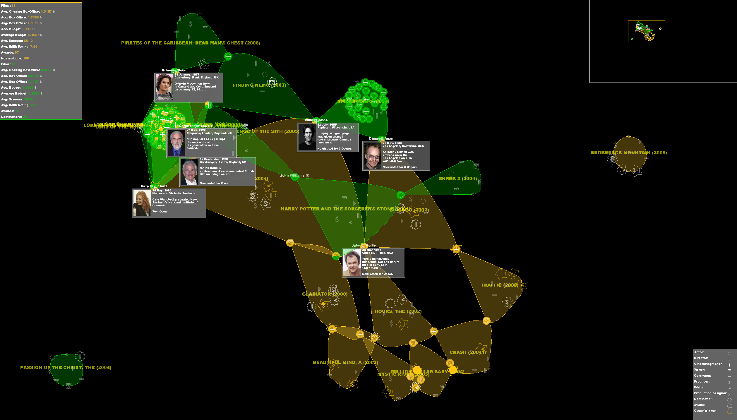
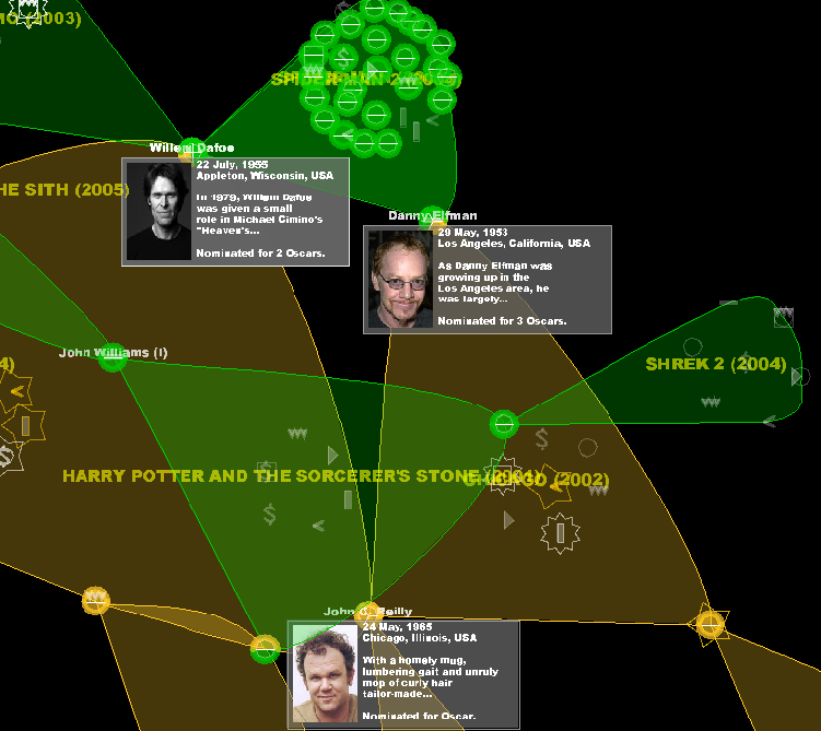
Figure 5. Detail of the visualization of the most awarded movies (yellow) and the films that earned more money (green). We can observe how overlapping and pie charts helps us with graph interpretation without effort. Top group of two-sector pie charts with more opaque zone are the overlapping of the two movies of Spider-Man, with nearly the same cast. John Williams (center-left), although inside a yellow movie, is easily distinguished as out of the movie because of the pie chart and the green zones connections. Danny Elfman is in three movies (three sectors, two green and one yellow), participating in the Spider-man saga and in an awarded movie, 'Chicago'. By contrast, John C. Reilly appears in awarded movies but not blockbusters, working each time with completely different sets of people.